As I am sure you noticed, I changed the design of this blog
yet again. This time
I DID IT. I did not hire someone, I have taught myself the code & have figured out how to build, edit and modify my own template.
Among other things, I changed the background color to something lighter, and lightened up the blue wall paper on the sides - giving it more of a casual 'denim' feel. I think the white allows for the photos to 'pop' better and gives the blog a lighter, airy feeling.
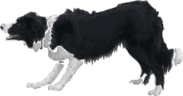
To top off the revised feel, I designed a new post divider. The border collie in the divider is actually Dianne Deal's dog Fame from a photograph I shot of him last year at the Fire Ridge SDT.
Dianne's Fame
Please tell me if you see anything funky on the blog. I changed the font too. Is this easy to read? Or difficult? Because my monitor is the size of the moon (27") it is hard for me to tell if the font is too small? Can you read it okay?
In the process of learning this I found a new hobby designing website & blog headers/banners. If you have followed the transitions in my
Look Back Photography site you will notice how many times the header has changed. Mostly because I cannot leave it well enough alone.
The first header/banner - it took me a while but I learned to hate the font....it is also too dark and well....
bleh.
This one was too big, thick and ...well, boring.
After a few versions of this one I settled on a design I liked, for the time being.
You can view my site at
www.lookbackphotography.com
All of the behind the scenes coding on my photography website is done by my
web guru JR Customization - but the design of the individual elements is all mine. If it looks like crap point the finger my direction. I have been playing with the graphic for the gallery page too.
It started out like this - too busy. What the heck was I thinking with all the frilly crap?
Then I decided to drop any hint of wedding photography from my portfolio. Still too busy.
I still didn't like it until it evolved to the final version - which I am going to change eventually. Because that is just the way I am...
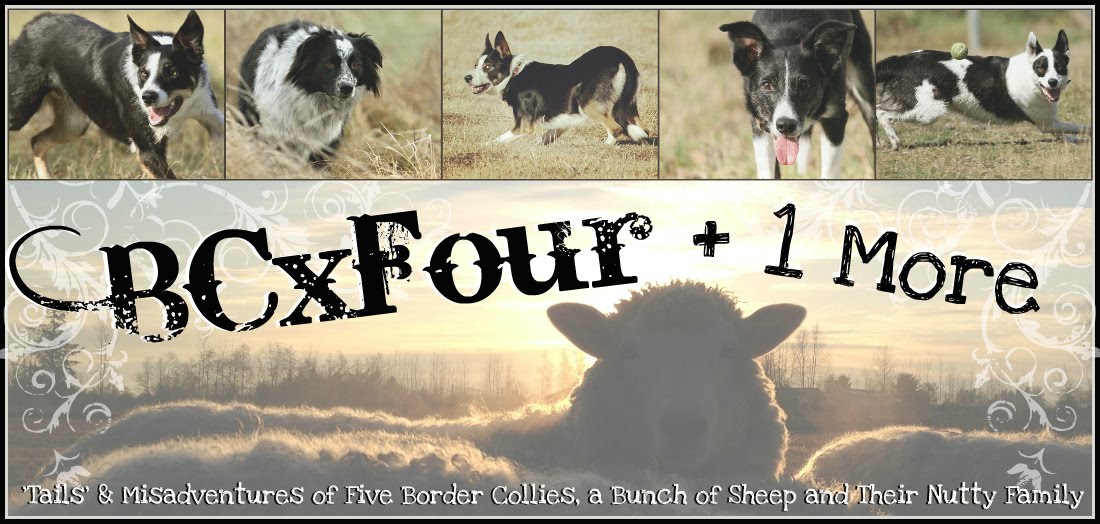
Then there is this blog. As you know this is the final header I designed for this site. I wanted it to be cohesive in feel with my photography site & photography blog giving a seamless transition between the three.
I even considered going with a red/neutral brown theme. Ewwww yuck, huh?
You probably remember these headers...back when Brynn was still a pup and Bonnie was thin?
Then I had to add Bea to the picture. So the design frenzy started. This one was TOOOO dark and the + 1 More looks like it is melting over Bea's picture.
Then I had this one up for a couple of weeks - till I decided it was too dark and oppressive.
A simple snow/winter version - because I was frustrated.
Anyone remember this one?
There have been others over the years - because I am unable to leave anything alone. I must tinker with it, adjust it...mess it up then fix it again and again.
Here is the header I made for
Bea's blog. Come to think of it, I need to change this one too. It needs to be updated with current pictures & make it brighter with more colors.
Today I redesigned my friend Jaenne's blog. I made her a header from photos I shot of her dogs during trips to Idaho and a couple pictures she snapped of her new puppy Red Top Zane.
I came up with a couple versions for her to choose from. Mind you, she told me her favorite colors were blue, purple & orange. So, what do I come up with? Green. In my defense I had to work with the pictures that were available - there was no way to make blue, purple or orange work with these shots. Unless I made the photography b & w and just went with colorful fonts.
1st version is simple
2nd version - a little more detail (pictures)
3rd version - different background shot of Mo & brighter colors (this one is my favorite)
Then I changed up the colors again adding a reddish brown and putting in a picture of Jaenne' just for grins & giggles, finally giving a different feel to the fonts.
I ended up using the second one and redesigned her entire blog to reflect the new look and name.
Check it out
~ Rockin' Ewe Stockdogs ~ (formerly Kip & Mo & Molicious BC)
My next project is a new website for
Dianne Deal. I can't wait to show you what we are working on...coming soon.
Would you like to have a new banner or blog header designed using your photos? Are you interested in going beyond the templates Blogger offers? If you would be interested in helping this
STILL UNEMPLOYED sheepdog nut fund her summer trial season and feed the dogs please think of me for your blog design, header or website banner designs.
- Custom Blog Header $50.00 (4 designs to choose from)
- Both Blog Header & Blogger Redesign $75.00
- The Big Package: Photography session with you & your dogs, disk of 20 processed images, blog header and blog redesign $300.00
Happily accepting Paypal, sides of beef, bulk raw meats, gas cards, and/or canon camera gear in lieu of payment.
(just kidding...sorta :)
Email: carolynn@lookbackphotography.com


